June 29, 2011

thoughts on creating


I just finished reading Bittersweet: Thoughts on Change, Grace, and Learning the Hard Way by Shauna Niequist. I actually think I saw her book mentioned on another blog… another great thing I find on blogs is reading suggestions!

Anyway, one of the essays was on creating and why we need to create. I was particularly struck by this passage:
The world doesn't need another band, per se. It doesn't, strictly speaking, need another book or another photograph or another album. The general world population will survive without one more stage production and one more gallery showing.
This is the thing, though: you might not. We create because we were made to create, having been made in the image of God, whose first role was Creator. He was and is a million different things, but in the beginning, he was a creator. That means something for us, I think. We were made to be the things that he is: forgiven, redeemers, second chance-givers, truth-tellers, hope-bringers. And we were certainly, absolutely, made to be creators.
If you were made to create, you won't feel whole and healthy and alive until you do.
This resonated with me for several reasons. One, I loved the connection to God it presents. I like thinking about, wondering about, the fact we were made in his image and therefore our need to create is a connection to what is holy. Two, what a beautiful thing to recognize God as an artist and as a creative being. Some of my favorite Psalms give tribute to all he has created. And lastly, I get it. This passage puts into words the why behind my need to pursue my own personal creative endeavors and not just use my creative skills as a way to earn a living.

June 27, 2011

painting outdoors

The poster I recently framed was wrapped in a deliciously large piece of brown kraft paper. Right away I knew this would make a fabulous canvas for my 3-year-old daughter.

I clipped it to our fence with clothespins and let her have free reign using her brushes, her hands, and even her feet. I love watching her go for it with complete freedom. She doesn't feel constrained by the idea of making her art look like anything. Instead, she just enjoys the process. Us adults could stand a bit more freedom in our creative doings!


June 24, 2011

vine o mine – the update

Here's what we bought:


The yellow one supposedly grows to 20 feet. All the red ones had significantly less height. This particular one said 8 to 12 feet. That's enough to go up the pergola wall but not up over the roof. I guess we'll be counting on the yellow to take over.

The yellow in bloom. I love the firework explosion of the flower!


Here's what the pergola is looking like these days. The nearby garden is filling out and we've added a picnic table, a gliding bench, and some other furniture. We've gotten quite a bit of use out of it already this summer!

June 22, 2011

hang it up!

My Festival of the Arts poster is freshly framed and hung. I absolutely adore the work of Alynn Guerra so I was quite pleased when I found out she was creating this year's poster.


And hanging my animal collection for the nursery is finished thanks to the dear husband. The smaller pictures are actually greeting cards. The larger one was made my great-grandmother for the nursery of myself or one of my sisters (20+ years ago!). It's crewel work, which, as I understand it, is a type of embroidery that uses wool yarn. There are a lot of different textures created with the different stitches and techniques. Interestingly enough, my little baby stares at it quite contentedly while I change her diaper!


June 20, 2011

a lovely shade of carrot

I was peeling carrots the other day and couldn't help but notice how fabulous the fresh orange color was against the turquoise of my cutting board.

June 15, 2011

Quilt gifts!

Some of my favorite gifts received in this new-baby season have been quilts.

The first is a family-sized quilt perfect for snuggling under and watching movies. It just so happened to match my basement TV room which is already black, white, gray, and red. I also love the fact that it incorporates scrap fabrics. In fact, I had been thinking I should create a quilt for that room myself. Check that one off the list!

The woman who made it for us is very casual in her approach. I once heard her say she works on a quilt until she runs out of fabric. The exact size is not so important to her and I don't necessarily think she follows patterns. I like that attitude! No pressure for perfection, just a very functional piece of art in the end.


The other one that I am going to share is inspired by Eric Carle (check out his blog!), one of my favorite children's book illustrators. There's a line of fabric created using his distinct illustrations. This play quilt was custom created for my little one by KTjDesigns. She does beautiful, colorful quilts and other lovely baby goodies.


June 13, 2011

Martha, I love your poppies!

As some of you may remember, I have a bit of an obsession with poppies and poppy-themed art. I just like them. I suppose the sassy bright red-orange is part of the attraction. So you know that I just loved the May 2011 cover of Martha Stewart's magazine.


Once I finish my current project list, those simple stamps are a must. Look at the pillow! I am also imagining pillows in my not-yet-reality update to the sunroom. And perhaps curtains with blooms – a pattern? Or growing from the bottom? In fact, the cover might inspires me to stick with warm colors (plus green, the neutral of nature) and incorporate pink. 


So now where do I find the perfect couch in orange, pink, yellow, or lime green?

June 10, 2011

GR Reads 2011

The last big thing I completed before my maternity leave from my job as a graphic designer at the Grand Rapids Public Library was promotional pieces for this summer's GR Reads. It's a summer reading program for adults and this year's theme is good vs. evil.

My first inclination was to do a design in stark black and white. Or perhaps using some gray to represent the so-called gray area. Maybe a fuzzy border between the black and white? Perhaps the words "good" and "evil" and reflections of each other? Linked? Grown together? Is the line between the fuzzy or solid? I had many many visions, sketches, and drafts. And nothing was pleasing me.

Then I thought some more about GR Reads, the overall program, and realized that it was supposed to be fun. Sure, some of the books are obviously going to be serious in nature, but the point is for all of us to have some fun reading and go to some interesting programs. It's summertime, not homework time.

So I switched directions, introduced some bright color (I do love our color palette), added an outsider font and created an illustration for the theme that's just a touch lighthearted (reusing and modifying characters from the font, I might add). At last, a design solution I am pleased with!

Tah-dah!

June 8, 2011

recycled kid art & paper crafting

Recently I gave new life to a wrinkled, water-torn paint experiment created by my 3-year-old. I've read books about introducing your children to art and the proper way to encourage their creativity. "Destroying" their art in order to create something else is a big no-no. However, knowing this piece wasn't a keeper in my household anyway assuaged any guilt I might have had.


I used the abstract textures as the basis for some cut paper greeting card creations. I did flowers for mother's day cards and stars for graduation cards. The actual cards, a boxed set of solid colored cards with white envelopes, has been one of my most useful craft store purchases.


By the way, when my daughter emerged from her bath and saw what I had created by cutting apart her painting she was most intrigued and expressed a desire to try her hand at cutting (scissors are a new thrill). So much for being horrified at the destruction of her masterpiece!

June 6, 2011

Sunroom color palettes

So after we paint the kitchen – perhaps next summer – then my next room to tackle will be the sunroom. I have actually already painted it a nice sunshiney yellow and have no intentions of changing that. Now that we are working on furnishing and accessorizing the adjoining outdoor room (the patio and pergola of last summer's labors) I am contemplating the sunroom as a parallel space. Like the patio area and the sunroom are sibling rooms.

Right now we have a couch in there but it is there by default and not design. I redid it in college with the help of a seamstress friend who was always willing to assist in making my visions reality. I have quite enjoyed it but the colors are not something I chose with this particular space in mind. Besides, we have long discussed getting a pullout couch of some kind so that we have a place for a guest to sleep if the need arose. I just read in some design magazine that you should always get neutral furniture so you can update the accessories in the room and completely change it. But I, the one who owns a red couch, may just be inspired to buy a purple or orange one for this room.

I am also pondering some bold, modern, floral pattern curtains on the two windows that face each other. Something with vines that are similar to the ones we are growing outside perhaps?

And a nice big rug for the center of the room. Perhaps an end table with a lamp? A cozy chair tucked into a corner for reading? Maybe a coffee table? I have an old cedar trunk tucked into a closet that might make a nice surface.

We have also discussed moving the rocking glider indoors during the winter so that makes me wonder if I should leave space for that.

The current room is mostly occupied by the cat. As you can see, it was added onto the exterior of the house so the brick and what was once an exterior window are a part of the room. I kind of like that uniqueness.


Here are some color palettes I have been pondering:

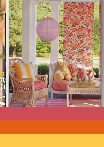
This was from a recent issue of Midwest Living. I can't say I've really explored using pink much in our home before now.

These are pages from a recent Crate & Barrel catalog. Of course I am attracted to all these bright colors. The warm purple is the same shade I painted our shutters and exterior doors last summer.

I am very intrigued by the combination of the ocean teal (the color I envision for the kitchen) and the warm purple. The room is from House Beautiful and the ad is for clothing by Coldwater Creek.

In the end, the decision will most likely be made by finding the perfect rug, fabric, or couch and going from there.

Any opinions anyone?

June 3, 2011

Other uses for Easter egg dyes?


We got all done dying Easter eggs this year and the full cups of dye sitting there unused but for a single egg seemed like such a waste to me. A quick google search confirmed that other people had used the dye for fabric. So I cut up an old t-shirt and gave it a try.


"Now what?" you ask. Very good question.

If anyone has used the dye for something interesting or knows of a crafty blogger who has, please share with us!

June 1, 2011

Look what I made!

A superhero out of my daughter! By request, she got a superhero cape for her birthday. One side pink and one side purple, as chosen by her.

I found out that sewing curves is a bit more challenging than sewing straight lines. You could call it a learning curve! I was grateful the pattern was rather forgiving. You'd have to be studying it pretty darn close to notice my difficulties!